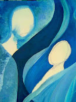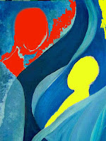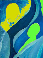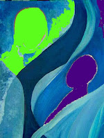


I am still playing with my single hue painting. I have the background done, I think. One half is very smooth and flowing. The upper half is more textured and has more hard edges. I wanted the contrast between the zones of the two figures. I started playing around with what colors I may use for the figures.
This is one way I really like to use my photo editing software. I use PhotoPlus by http://www.serif.com/ they have been publishing software for ages. Their market is very heavy into schools and other educational entities. I was introduced to them by a friend who was teaching college at the time. One very nice way to try out their stuff is that older versions of the software are available at a big discount. I have been using PhotoPlus for over 15 years, upgrading occasionally, but the features are all there. It is equivalent to PhotoShop. Has all the same features, is very easy to use - fits my budget better too. Here I tried out several color combinations for the figures. I took the photo of the painting at this stage, opened it up in the software, then filled in different colors. I can try these on for a while and then decide which to start with. I may still paint over my first try - but I find playing with the colors before actually picking up a brush helps me decide which way to try first.

No comments:
Post a Comment