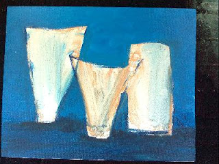
Classes have resumed and so have my demonstrations. The first week I finished the rusty pail with onions and gourds. Then I did a quick seascape for the other Jackie. This week I finally began the first real demo of the school year.
This will be a simple still life of 3 vases. I will use it to go over basic principles, that if followed, will help you create a better painting.
1 - use your entire canvas. No matter what size your layout or the photo or sketch you are working on, make sure that when you transfer the image onto your canvas, you fill up the space you have so the image will have proper impact.
2 - vary the sizes of your objects. I like the Goldilocks principle best, have one larger, one smaller and one medium size. They do not have to be drastically different, just a small variation will do.
3 - no kissing! Either your objects should overlap (which gives the illusion of distance and space) or there should be a large enough gap between them that it is obvious. No 'just touching' or kissing allowed.
4 - objects should be sitting on a surface with definite cast shadows. The shadows are what 'glues' an object down, otherwise it will appear to float. The color of the shadow is a darker value of the surface.
5 - the background should be a lighter value than the surface the objects are sitting on. It can be a different color or not, but usually a lighter value.
6 - try to avoid having one object dead-center in the painting. If the objects overlap, try to have the grouping slightly off-center. This will make the painting more interesting and less static.
7 - vary the values slightly in large areas, such as the background. By varying the values and giving the area interest with varying brushstrokes, you make the background more interesting and easier to correct in the future.
8 - overlap the shapes of your objects with the background. You always want to finish the objects by painting over the background. So if the background sneaks into the object's area first, you can then paint over it. The overlapping brushstrokes will help the object appear in front of the background. Trying to butt two brushstrokes next to each other doesn't work well, you usually leave a tiny gap showing and it looks amateurish.
Whew! That was a lot that we covered in a short demo. More to come next week!
You are welcomed to join the class, Thursdays 9am til noon, Base Rec Center in Myrtle Beach near the new Market Commons area. All skill levels, all media welcomed.

No comments:
Post a Comment