Monday, March 8, 2010

Storm Unravels

My latest painting. Done in oils. Inspired by a moment during my trip to Florida. The sky was breaking up, you could still see showers in the distance, but the clear blue sky was showing behind the clouds that appeared to be woven together like a rough cloth, were unraveling in front of our eyes.


I tried to capture that wonderful intense moment.

Sunday, February 28, 2010

I entered a contest for a design of a t-shirt for the 5K.

No prize money, but a good cause and I came up with the idea very quickly.

I like the look, its different.

All the little things like this will get your name 'out there' as an artist and you never know where it will lead.

Logo for Boardwalk Contest


The City of Myrtle Beach is running a contest for a logo for the new boardwalk in town.

This is my entry. It looks good on a letterhead, on any style shirt, as a decal or sticker...

I hope the City Council agrees and chooses it as the winner.

Even though graphic arts is not my specialty, I think I have a good eye for design. When making your living as an artist, trying for alternate sources of art income is always a plus.


Friday, January 29, 2010

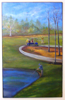
Golf Course Mural


I painted a mural for Marge. Her condo overlooks the golf course but her living room had a large access panel that added nothing to the room. So I created a scene similar to the one outside of her place and painted it to appear as a window. She enjoys watching the golfers as they play so we made sure there was a foursome in the mural.

Decorative Vines on Door

Added some vines to the closet door for Marge. They add a decorative touch to the room and hide a few flaws. A very good use for paint. We both like how it turned out.

Saturday, January 23, 2010

Class Demo Jan 2010 part 2

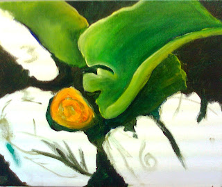
I began the leaves...
Try to start with the objects that are 'fartherest' away first then layer the objects that are on top of them next. I began with the small leaf on the right then worked my way counter-clockwise.
If you keep you hand out of wet paint, it is less likely you will smear the paint on your canvas. Also try to keep wet paint off your paint brush handle, that leads to messes too.
Do not just just one shade of green when working on large fields of green objects. I used not only sap green and pthalo green, but also ultramarine blue, two shades of yellow, brown and red in the leaves. Having subtle variations in color will make a work more painterly.
Bright highlights in green are better created with yellows rather than straight white, since the white will create a chalky color.
Blending can take many applications with a light touch to get a glassy smooth look. Use a soft flat or fan brush to blend.
Values, values, values - watch where you place your values. An object above another will be lighter and have brighter highlights. Use values to create the look of a the curl of the leaf. Not all value changes have to be drastic, small baby steps of differences will make a difference in the illusion of 3D in your paintings.

To be continued...

Sunday, January 10, 2010

June Art in the Park

Art in the Park, June

The intense heat melted and warped the air. Dust particles, too tired to dance, made a thick film on sweaty places.

A few brave souls strolled by my tent, slowed by the heavy air, their enthusiasm draining with each step. The first day of summer arrived with temperatures better suited for a pizza oven. The army of colorful artwork, shiny stands and white tents could not fight the blistering conditions. The metal screens stood bravely in the dust, holding my paintings for the people to see.

“Look here!” the canvases cried out; but it came out more as a whisper. “Here are pieces of her inner being. These are not just pretty pictures. They are the result of battles, the struggles she took to capture a fleeting moment. That instant when moonlight washed the path… The glow of dawn on her garden… The summer sunlight brushing against the palm… The wind in the grass... The feeling of a daydream… All fought hard before being captured.

The sweat I wiped from my face today is nothing compared to the sweat I poured into these paintings. Thousands of decisions, as well as indecision, plus hours of practice stand behind each brush stroke. The despair of ever getting it right and the joy when it comes together dance behind the paint.

Here is my soul baking in this heat, getting dusty in the park, waiting for someone to stop, or even just hesitate. A sale or just a kind word – a validation would temper the afternoon. Stop and look at them closely. Point one out to your friend. My spirit needs these small morsels to heal and grow. Only then can I slice off the next piece for another painting. Sales buy the supplies but the interactions grow the art.

FOR SALE: My soul, bruised and battered, but still able to dream.

Class Demo Jan 2010


Class has resumed for the new year. You can still join if you'd like; everyone works on their own project at the their own pace. I work on a demo each class. Started a new one for the new year, a water lily bud surrounded by the large leaves in a pond.

I started by placing the flower. If there were a tic-tac-toe board on the canvas, the bud would be placed at the lower left intersection of the lines. I made it a little bit larger than it appears in the photo. I then placed the leaves. I made them go out to and beyond the edge of the canvas. I wanted the plant to be the canvas, I was not interested in getting too much pond to show. I left a few out, made some larger, made some smaller - edited them to make a better painting. I even numbered them, treating this like a still life painting and making sure I have an odd number of items. It will also help when I go to paint each of them to keep track of the different leaves.
Remember, I am creating a painted based upon a photo, not painting a copy of the photo. I want the painting to be better than the photo.

Then I painted the background, the little bit of negative space around the leaves. I used a combination of Van Dyke brown and phtalo green. Any dark brown would work and I wanted a cool green, saving my warmer greens for the leaves. I mixed them as I went. Some areas are more brown, some more green... just like the surface of a real pond, it is not just one color. I kept the subtle variations. I blocked in the flower with an Indian yellow.


I am on vacation next week. Kate will sub for me. I will continue the demo on the 21st.